Otter
Coffee.
A mascot-led coffee brand built for Seoul's saturated café market — designed during the pandemic with tight production constraints and a bold character at its core.
A mascot-led coffee brand built for Seoul's saturated café market — designed during the pandemic with tight production constraints and a bold character at its core.
Project
Otter Coffee
Category
Brand Identity
Location
Seoul, South Korea
Industry
Food & Beverage
Brand identity — mascot, logotype, and Korean/Chinese typographic lockup
The Brief
Otter Coffee launched in Seoul in 2020 — at the exact moment the pandemic shuttered every sit-down café in the city. The brief was simple and unforgiving: build a brand fast, build it cheap, and build it for a hole in the wall. No interior. No tables. Just a window, a cup, and a reason to stop.
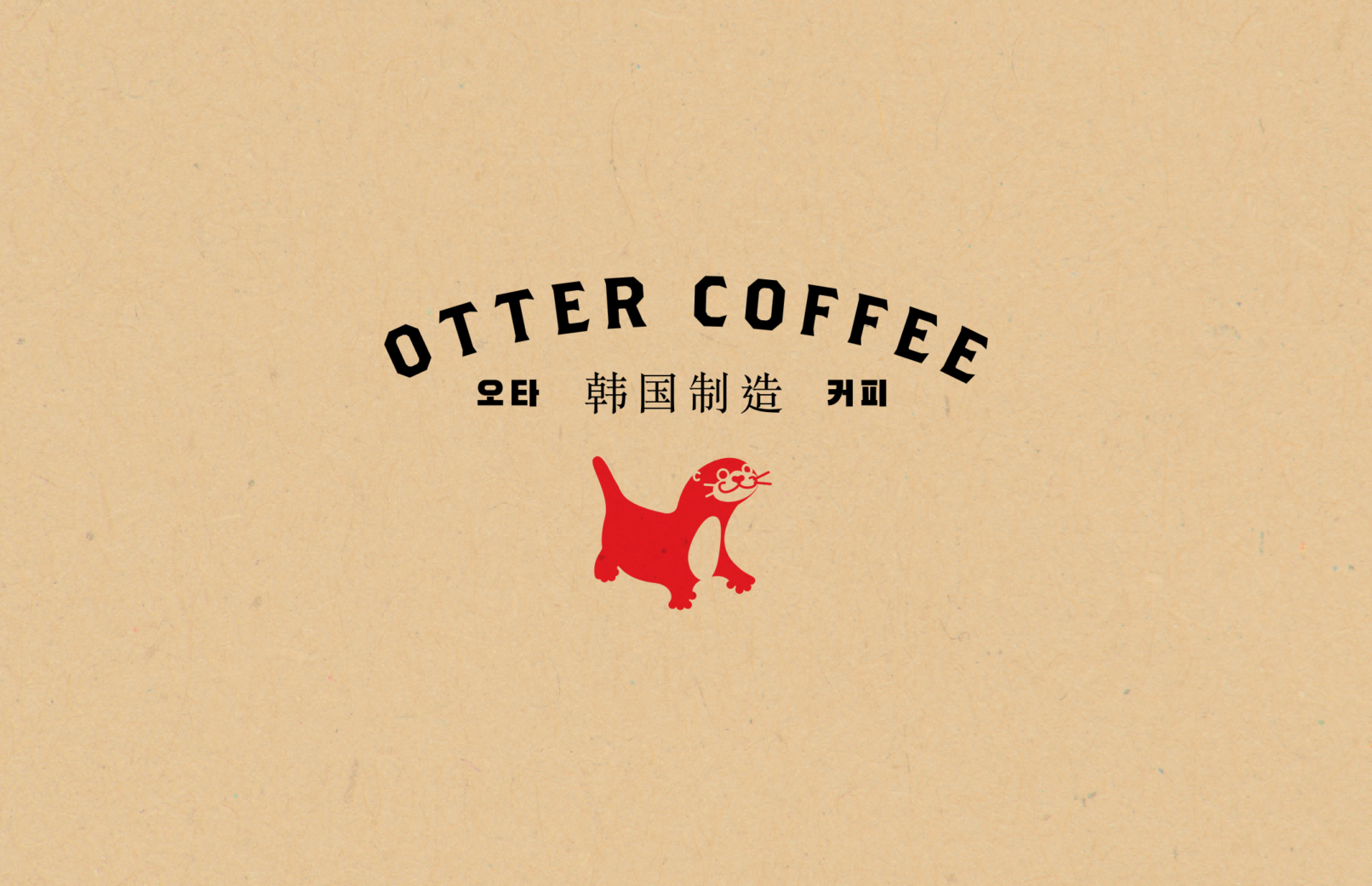
The constraints became the concept. A mascot-led identity was chosen because it could live on a stamp, a sticker, a paper bag, or a building façade without losing any of its personality. The otter character anchors every touchpoint — paired with a bold arched logotype and a trilingual lockup in English, Korean (오타 커피), and Chinese (韓国制造) — built for a city where every café competes for the same street-level second of attention.

Brand system — colour palette, mascot variants, and type hierarchy
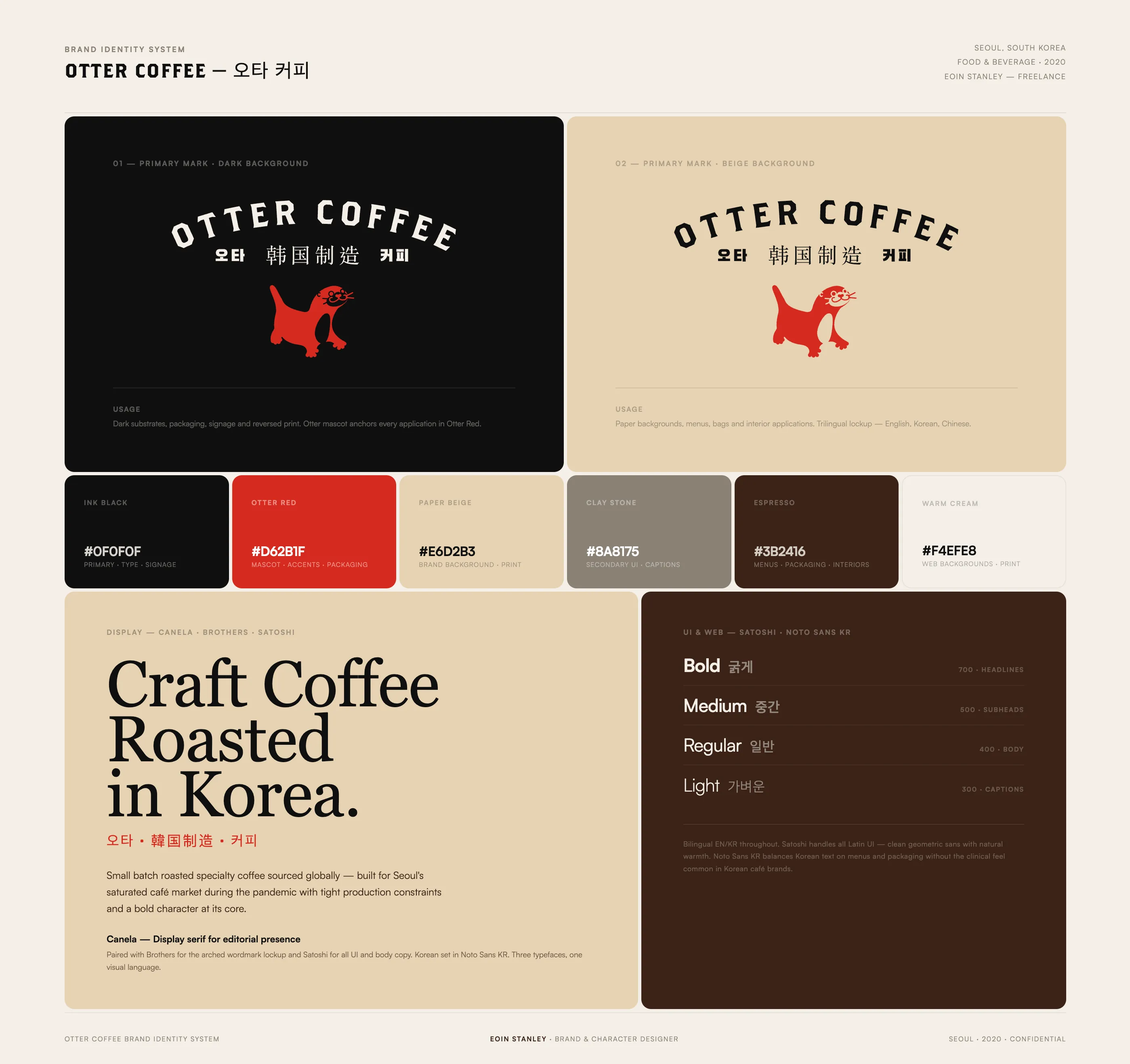
Identity system — logo, colour palette and typography

Brand applications overview

Coffee bag packaging — kraft finish with mascot stamp detail

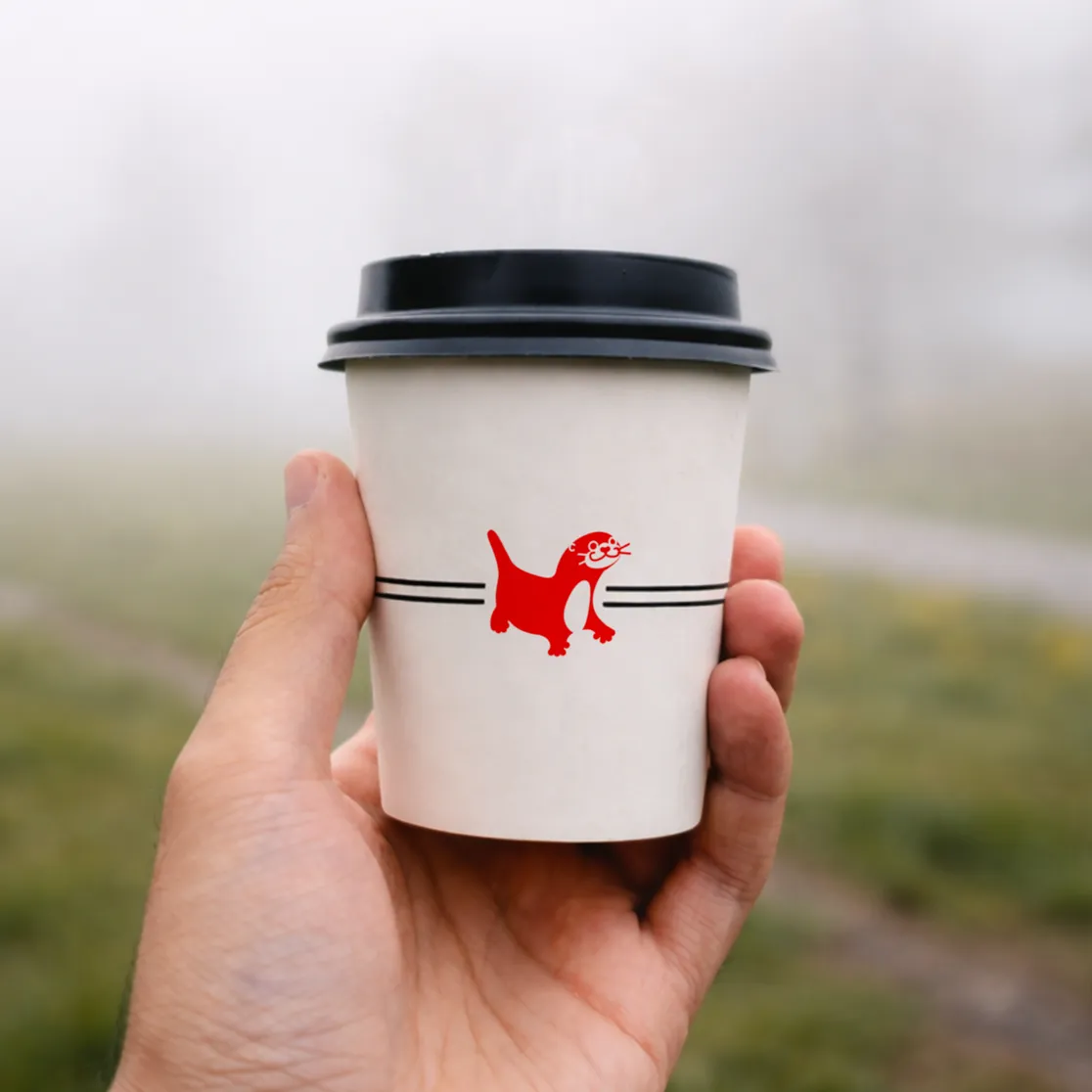

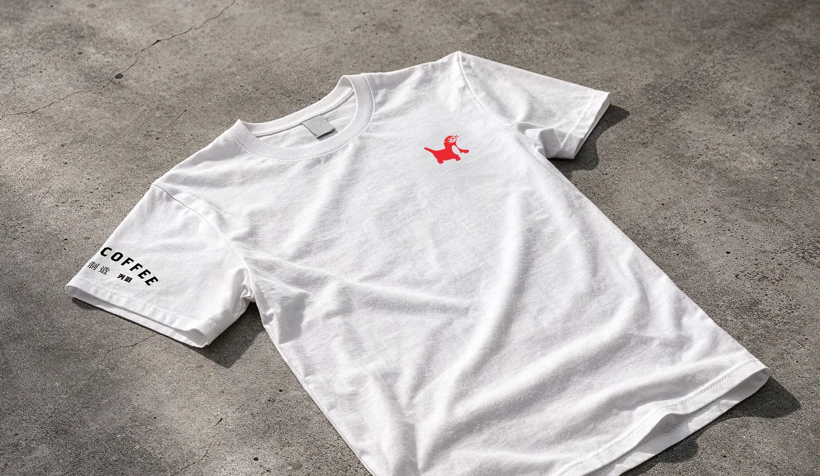
Cup, business card, storefront signage, and staff merchandise — the identity scales from building to garment